THIS SITE
USES COOKIES
USES COOKIES
We use cookies to ensure that your experience is secure.
By continuing, you agree to the tracking described in our Privacy Policy.
I Accept
Gin Filmes
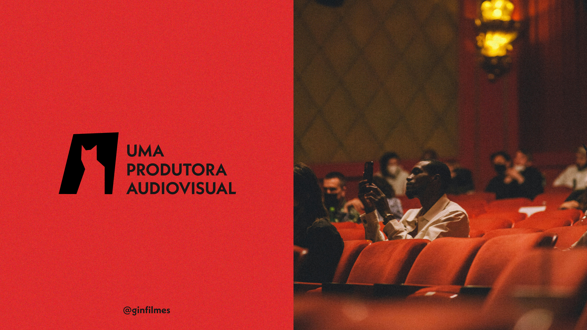
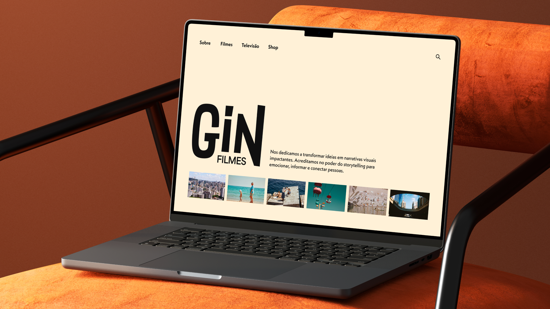
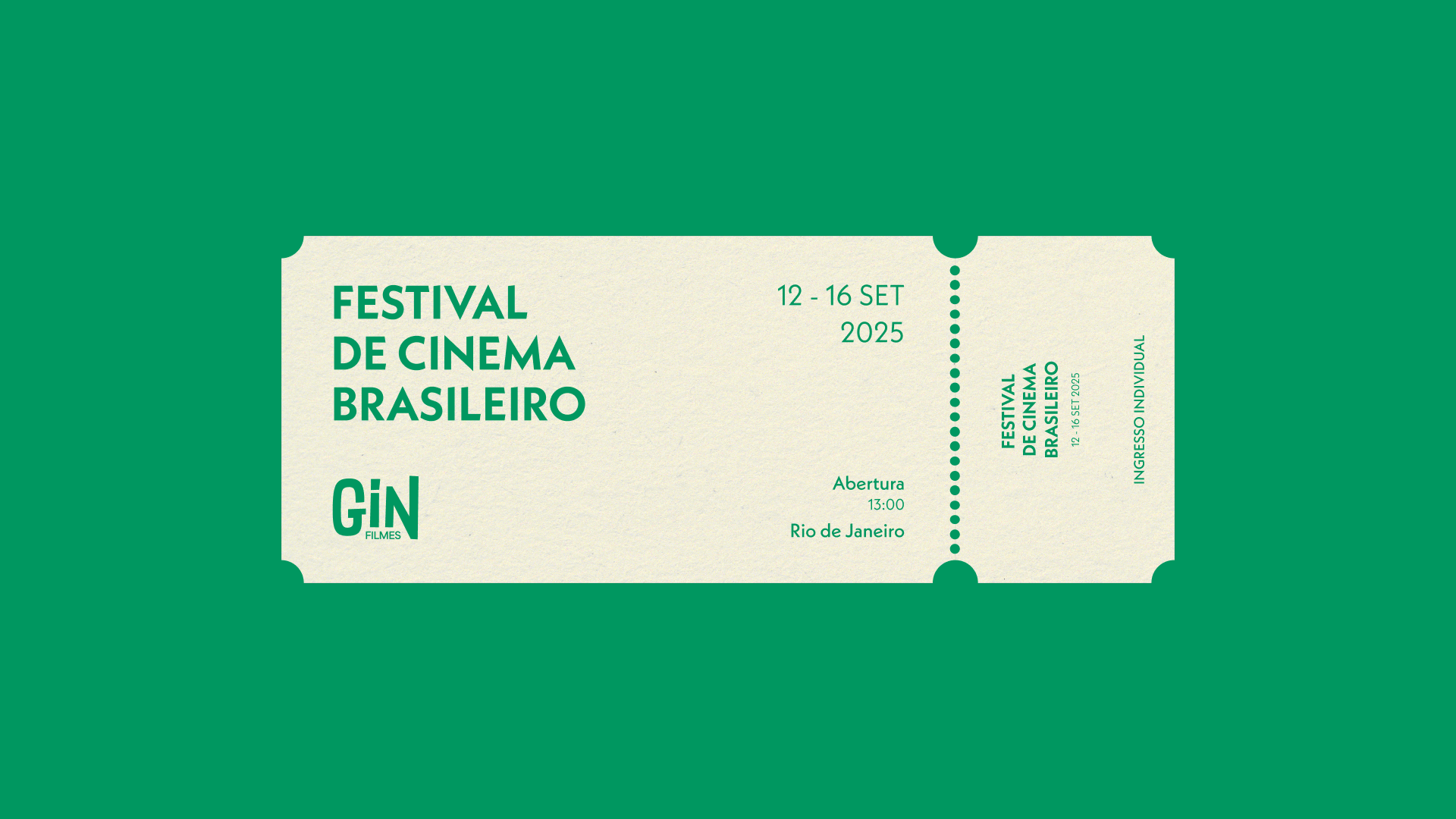
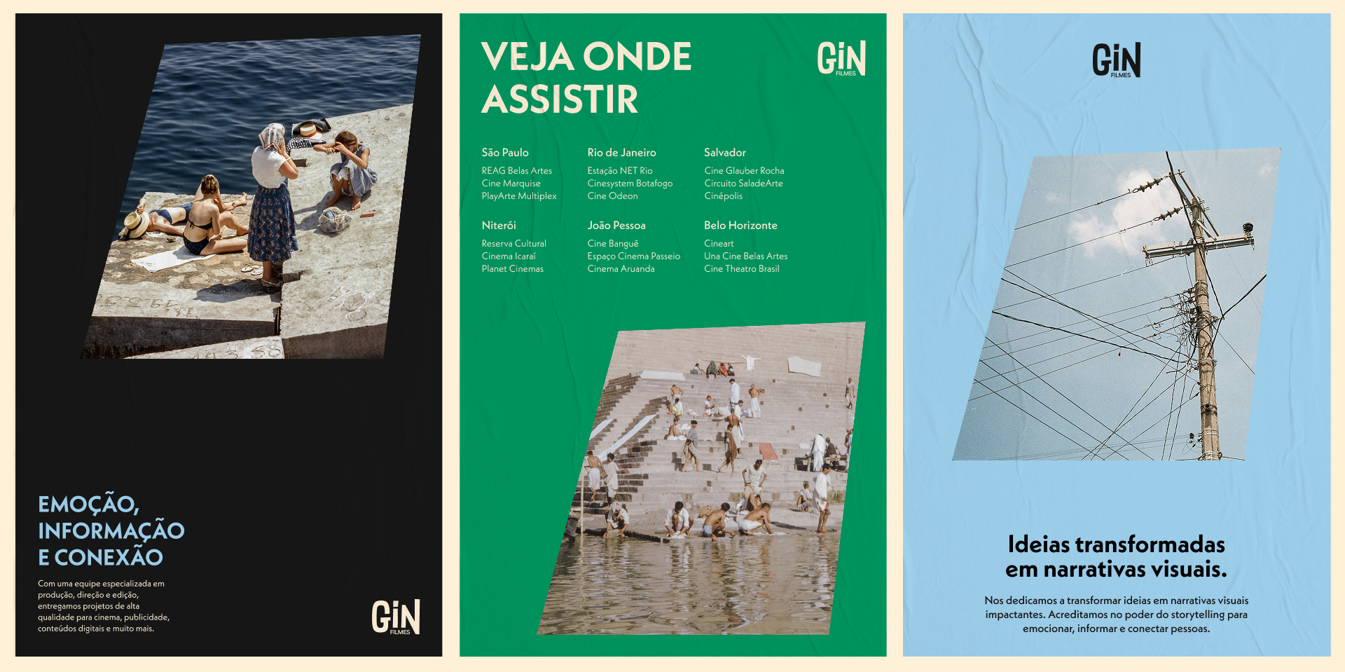
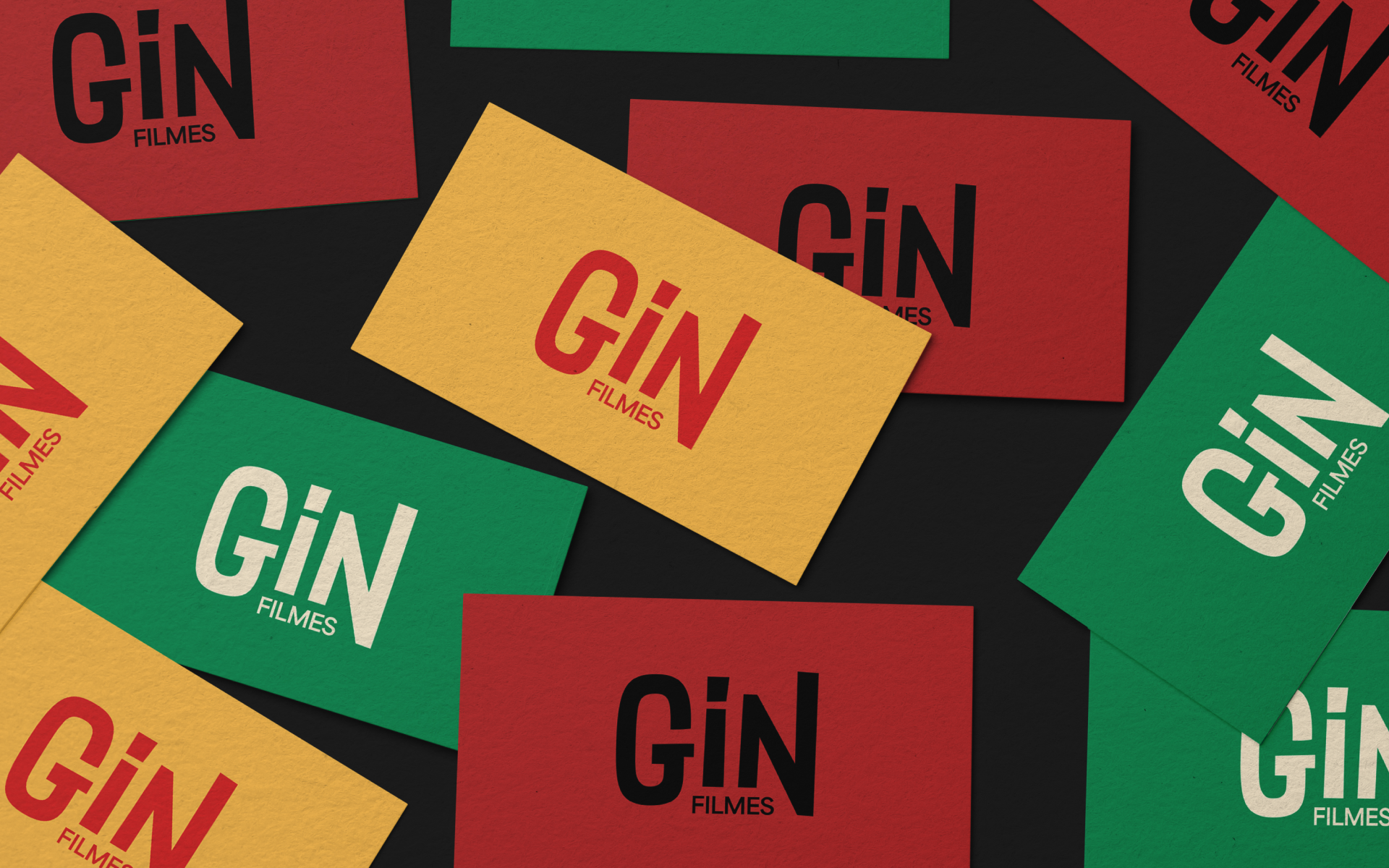
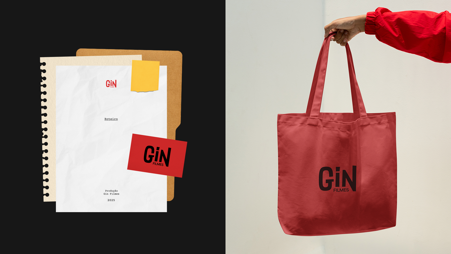
Inspired by the graphic language of Saul Bass, a key reference in film posters and title sequences from the 1950s and 60s, the Gin Filmes identity is built from cut-out shapes, asymmetric strokes, and compositions that break away from traditional rigidity. The result is a brand that conveys movement and expresses the creative impulse behind each project.
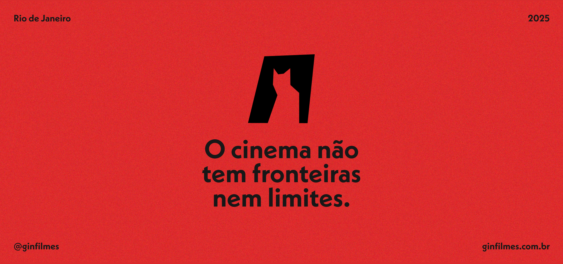
Every element is designed to evoke motion, experimentation, and expressiveness — values that are also central to Gin’s cinematographic language. This more gestural approach is balanced by a visual system rooted in the rationality of modernist geometry. The brand’s typography, alignments, and graphic structures follow a constructive logic that brings clarity and cohesion to the overall identity.
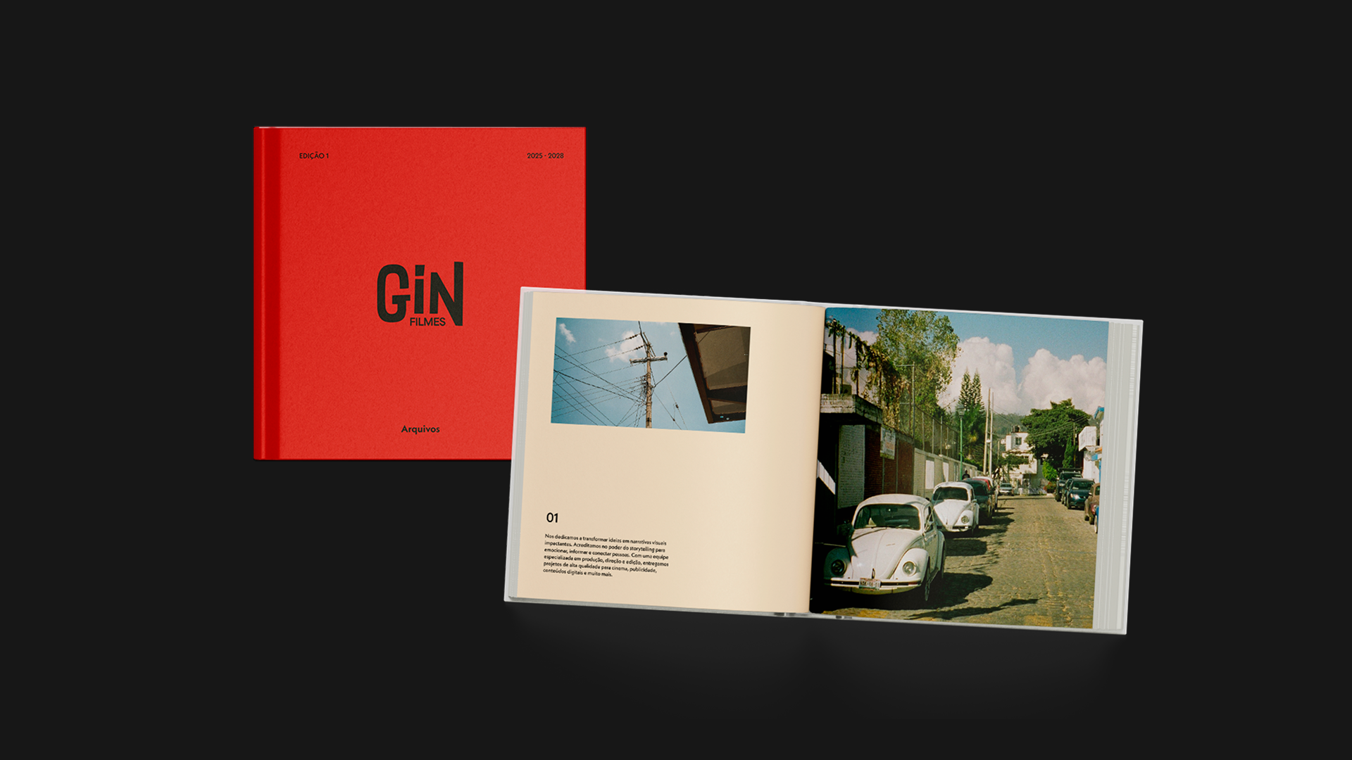
The project aims to establish a strong, versatile visual identity that reflects the studio’s creative approach and reinforces its positioning in the audiovisual market.
Project
specification
Project
Visual identity for the film production company Gin Filmes
Client
Gin Filmes
Date
June 2025
Team
Design: Clara Bernardes, Valentina Harif e Nicole Ann